There was a sneak update a few hours ago, so I thought that it probably had something to do with the tablet release.
Back in May, I published
this post with the first tablet screenshots that were released.
Today, going onto the yppedia, it seems that they've been updating all the screenshots to their newer counterparts!
Along with the
iPad game documentation that was release awhile back, it seems that the release is just around the corner!
(Though, "around the corner" in YPP terms means "a long time")
I keed. I keed.
I'd like to share some of the more interesting screenshots here.
Mostly because I like commenting on them, but everyone in crew chat is ignoring me :P (except Mex :D)
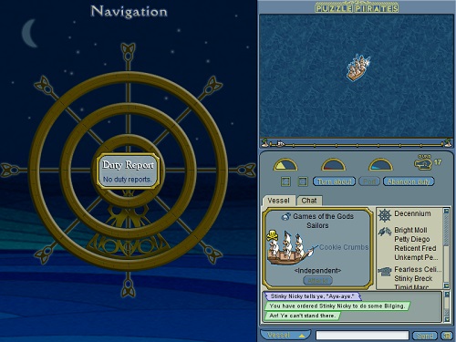
idk if it is better or worse, honestly. Before, I could just glance at the list to see the pirates, and now I have to click the little collapsible menus?
This is actually really nice. Mostly because you'll be able to simply click on the "can I gun" pirate to see their stats right away.
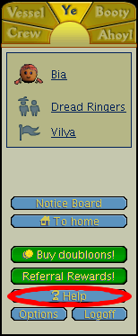
The Ahoy tab
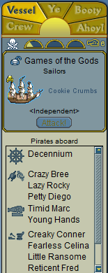
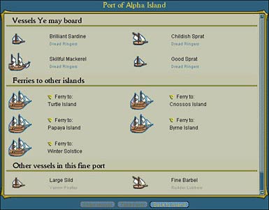
The Vessel Tab
Hmm. Not much to say except that it is a lot wider. That horrid salmon color again.
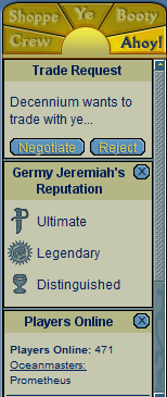
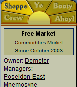
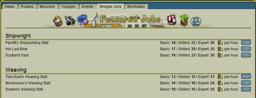
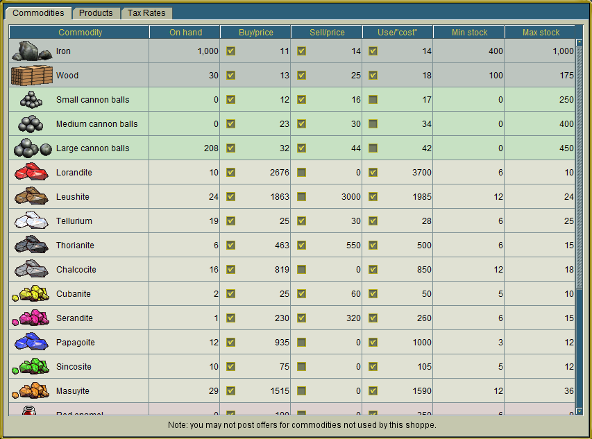
The Shoppee Tab
That is actually the Shoppe tab. Eh. Still not a fan of the color scheme. I guess having it wider is rather nice though.
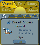
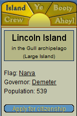
Island Tab
I do like that the Go Home whisk is now so prominent! It seems that they have moved items on the Ye tab to various places.
I guess I possibly could get used to this.. bland colors ><
Interfaces I really like
Most of the above can be seen on the
official:Ui page on the wiki. (Does the lowercase i bother anyone else?)
Interesting ordering tab. Very tablet. Props to that.
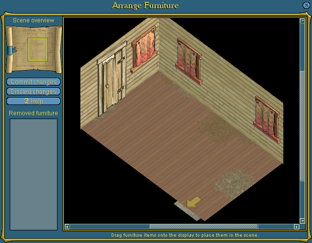
As an
avid decorator, I absolutely LOVE this decorating interface! Granted there is still no "search" in the "my furniture" section, it's still a lot nicer than having to scroll through the entire booty tab.
May I just say.. I think this is a great nav table overhaul.
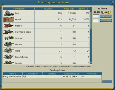
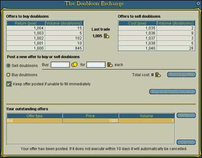
Woah, I really like this one! I know it is pretty much the same, but having the "inventory bid tickets" on the left side really improves things. I'm sure shopkeepers would appreciate this too.
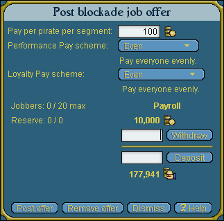
As a governor, these look to be far easier to set. Thanks for that!
<insert joke about how they're not going to get any jobbers>
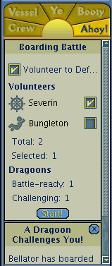
Oooh. New MAA interface. I guess it'll be much easier to tick and untick everyone with a touch interface. Because I'm about 99.9% sure that they have not fixed the MAA bug.
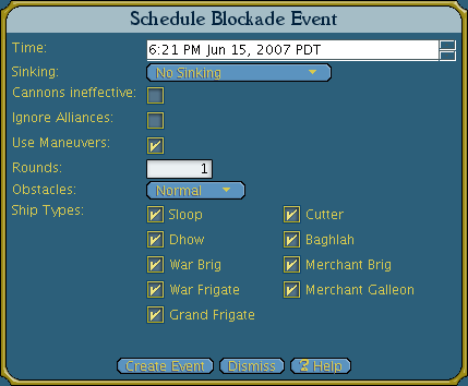
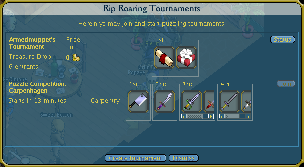
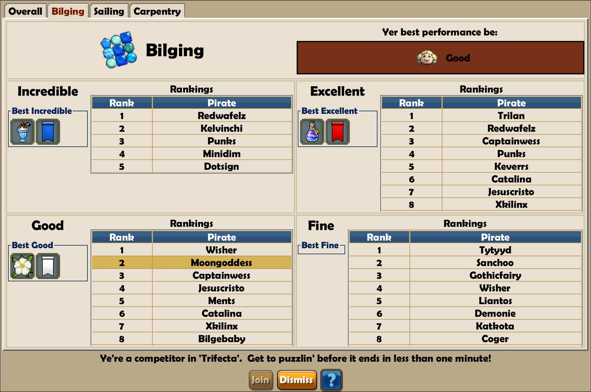
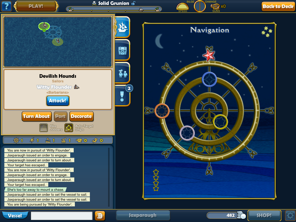
Ehhh. Is it just me, or is the new Tournament board really weird. REALLY. Weird?
I wanna say... wow. It looks great. I really like it. Not sure if the whisking thing still works (to homes in the same arch).
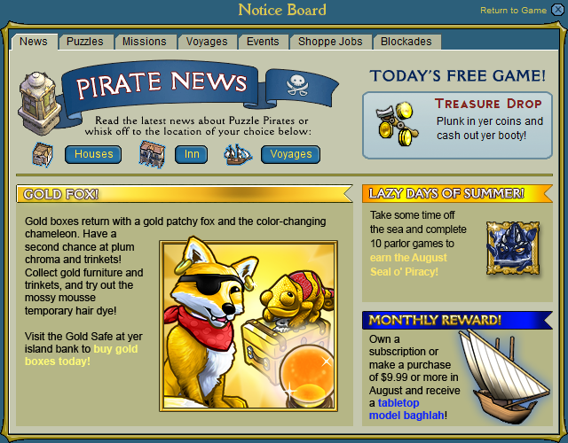
WOW. Really impressed with this. Much more prominent, and easier to find. Although, it's still technically the same info :P
RIP Ye tab I guess :P
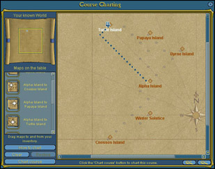
These ones below look pretty much the same:
Man... This looks pretty much the same as it always did... only with a chrome surface. How disappointing. Been wanting a dock overhaul since forever.
Others
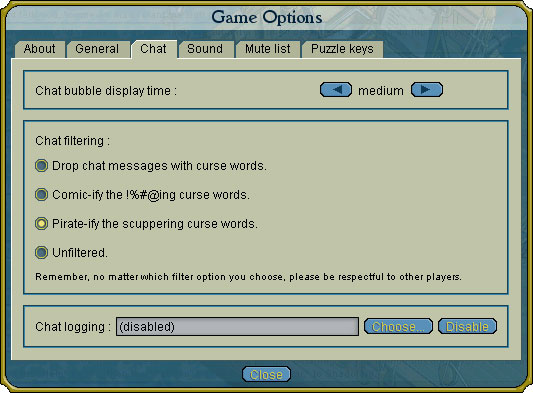
This is great. The options panel looks to be a lot less cluttered. Unfortunately, it also means that the video that I just made yesterday is now obsolete :P Oh well.
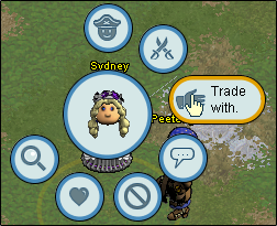
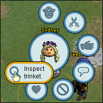
New radial! Groovy. I can't help but notice that the trinket one disappeared D; NOOOOOOOOOOOOOOOOOOOOOOOOOO. How else will I show off my Galene Doll?
Edit: Phew. False alarmm..
Makes no sense
Okay... that decorate button on the left side makes absolutely no sense. Am I missing something here?
All I could find for now. Hope you enjoyed this :)
What do you think of the new interfaces?


no fair, Tablet looks much better than Computer version
ReplyDelete